Vodka, the Russian national drink, is one of the most popular spirits in the world. Not only is its unique taste and mellow taste popular among people, but its bottle design is also an eye-catching part. Have you ever thought about it: every label, every curve, every color tells its own story and shows unique art and exquisite craftsmanship. This article will use this as an entry point to deeply explore the art and craftsmanship behind the design of vodka bottles.
“Design is in the details.” This applies not only to architecture, furniture design, but also to art, fashion and, in this case, wine bottle design. Each vodka bottle is carefully polished and designed, they penetrate the boundaries between art and practicality, allowing “form and style to share the best of both worlds.” Putting aside the delicious taste of vodka itself, we can also feel the designers’ good intentions from just looking at the packaging design perspective.
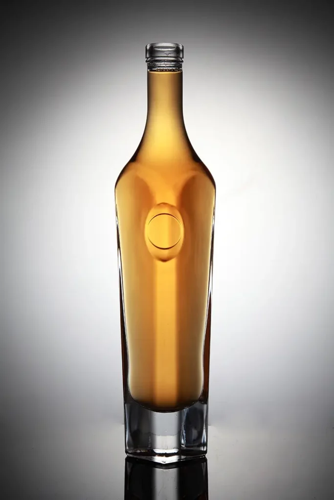
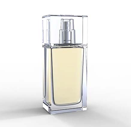
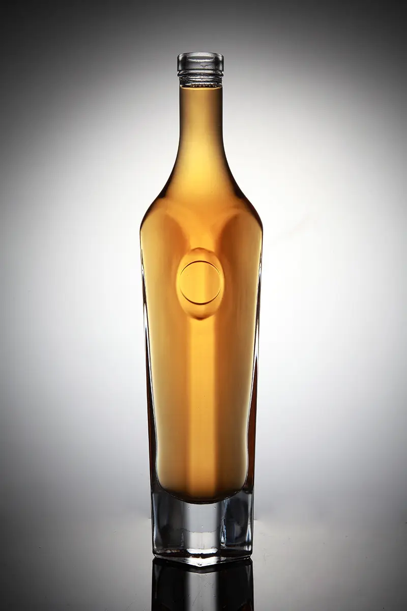
First of all, the shape of the Spirits Bottles is a crucial part of the design. Designers often choose bottles that are long, narrow, and light, or bottles that are curved and wide. Whether it’s straight lines or curves, designers are exploring the best shape to shape the bottle. The shapes of these Spirits Bottles come from life, nature, and even the curves of the human body. They incorporate art into them to achieve amazing effects.
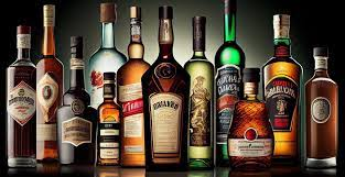
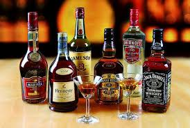
Then there’s the label design. The label is an important part of the vodka bottle design, carrying the brand image and values. Designers go to great lengths to attract customers, using unique quotes, brilliant colors, and even exaggerated language to grab people’s attention. Not only that, they also took into account legibility, message delivery and harmonious coexistence with the bottle form.
Color design is equally important. Some brands use traditional white and gray to give people a cool and refreshing feeling, giving off the impression that every drop of vodka is pure without any added impurities. Some brands choose bright and bright colors to stimulate people’s desire to taste them, so that people can feel its specialness at a glance.
Material design is also an aspect that cannot be ignored. Some brands use high-grade glass materials to create a noble and high-end feel, leading customers into a quality life. Some brands choose environmentally friendly materials to actively respond to the tone of green environmental protection, and at the same time express their long-lasting environmental commitment.
Finally, the innovation and meaning of packaging design. Some vodka brands adopt tough and contradictory design languages, which are full of power and convey “extraordinary character”. Some vodkas show “unique personality” with delicate, soft lines and colors, which impress customers at the first glance.
To sum up, the design concepts and craftsmanship techniques emerging in the design of vodka bottles are the perfect combination of artistic quality and practicality. Every bottle of vodka comes with a unique story and background. Designers perfectly blend art, technology, aesthetics and business backgrounds with only one purpose – to give consumers the best enjoyment.
In this era where people are increasingly pursuing quality life, vodka bottle design is one innovative attempt after another. Packaging is not only a link, the spirit of art and craftsmanship it contains gives us the opportunity to appreciate the unique charm of vodka bottle design. Maybe, the next time you buy vodka, you’ll be impressed by just a glimpse of the beauty of the bottle’s design.